

I’m trying to come to terms with all of the recent Facebook changes. As with every major Facebook release, users are confused and angry. This typically happens with any product release and people eventually get over it. Let’s face it, users hate change. There is really a fine balance in product building between adding all the features that you want and taking features away. Business owners tend to get really happy to add in stuff and push really really hard to get it. The job of a good product manager is to say NO. The job of a good designer is to make something uncluttered and useful. The entire world needs to stop justifying their job by measuring success on the number of features released. There should actually be product management bonuses issued for the removal of features (or not even allowing them in the first place).
So has this happened with the new Facebook stream?
It definitely is different. Different good? Meh. Different bad? That depends…
Facebook are pushing features like Lists and Chat quite heavily. But in the end it feels a bit bloated and schizophrenic. They have splayed various bits across the page with no cohesion. Some examples below:
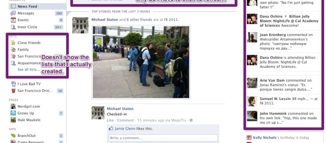
- Live stream – Not sure why this scrolls with a lot of useless information. It is distracting and confusing. The worst part is that the stories have no context to them. It is like your drunken Aunt just blurted out some random shit. But at the same time I am supposed to click to refresh the main news stream that has information that I actually want to read. This is a weird experience.
- Home links duplication – There are two links to Home. One on the right and one on the left. One says Home and one is the Facebook logo. This is useless navigation and a waste of screen real estate.
- Profile links duplication – There are two links to my profile with my name displayed twice on each page. Again, a redundant waste.
- Chat duplication – Chat is located in two places. In the lower corner (if you minimize it like I do) and on the left column. I realize they like to use photos, but this is a waste.
- Sponsored ads missing – there is a heading, but no actual ads appear. Bug?
- Lists – I have created my own custom lists, but they are basically useless in this new scheme. Facebook has decided that they are smarter than me and gave me new lists with suggestions that are not accurate at all. If I previously created lists, then they should appear on the top of Lists – not hidden.
- Ask a Question – This is like the Google Buzz of Facebook. Has anyone except Robert Scoble ever used this feature? KILL IT.
I’m still reserving judgement as I prepare for the next wave of changes, but wish that the folks at Facebook would be a little more conscience of wasting real estate, duplicating features across the homepage, removing unused features and not trying to outsmart me with their “smart” lists.
In the words of Confucius – Keep it simple, stupid.
Perhaps it is time to go back to basics for me with a happy little feed and less noise. Google+ anyone?
