

The evolution of the Starbucks pastry signs are something that fascinates me from a marketing perspective. I am a big Starbucks fan and occasionally I have been known to throw a breakfast pastry into the mix. This all changed several months ago when Starbucks was required to put the calorie count of each item on a placard. All of a sudden those “low fat” coffee cakes weren’t looking so sweet anymore at around 340 calories. ACK! Literally everything on the menu decreased in desirability when I saw how many calories they packed. Oddly, one of the lowest calorie items was a butter croissant weighing in at 310 calories.
This is where the fun starts. When they initially released this change, the fonts on the placards were big and bold and prominently placed under the names of the items.
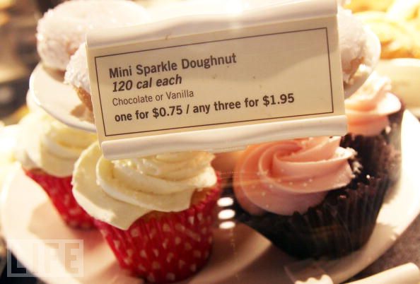
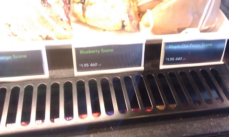
Yesterday I wandered into my local Starbucks to find that the cards had been cleverly replaced with new cards. Interestingly enough, the new cards no longer have the calories in such a prominent spot. They have cleverly placed the price next to the numbers of calories – presumably because people’s minds process all the numbers as one thing and discard the extra information. They have also made the font of the word calories much smaller. I have also seen another implementation of a new way to display calories that simply has the number with no indication that it is calories next to it. Unfortunately, I do not have a picture of this one.
Obviously I was not the only consumer who was put off by the calorie count. I suspect that Starbucks noticed a huge decline in sales and are now doing their best to reconcile the law and their desire to sell baked goods. I find this all very fascinating from a marketing standpoint. I would love to get my hands on actual sales data and how this tiny iteration might actually drive sales back up.
