

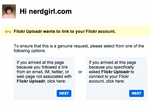
This is a wonderful example of what not to do when designing things. This is the Flickr authorization screen. Unless you are <1% of the population, you would probably be pretty darned confused when you came to this screen.
Why?
Because what exactly am I supposed to do here?
If you are like the rest of us, you don't really read all that gobbilty gook text that is very confusing and actually very similar. But that is the trick on this page! Ha! Gotcha. If you don't read it, you are screwed. So you read it and you have to pause (for several seconds) to really think about what they are asking you to do. Hmm. And those next buttons. Also exactly the same. It is maddening how retarded this page actually is and how Flickr have gotten away for so long with it.
How could it be made better?
Perhaps some visual representations of what the hell they are trying to get at. Like an icon of an email/link/twitter with something to represent that equals baaaaad. Or a screen of the app you are using to equal goooood. Just take away all that text that makes no sense and try to lead people to make the correct decision. (Or look at Twitter's auth process?) /kthxbai
